Clear Estate


Client:

TVH India Pvt Ltd

Scope of work:

Logo Design

Branding

Web Design

Outdoor Advertising

Description:

Green Leaf is one of the Indias’ leading clothing manufacturers, at the forefront of design, development, and full-scale production. producing and distributing clothing of the highest quality.


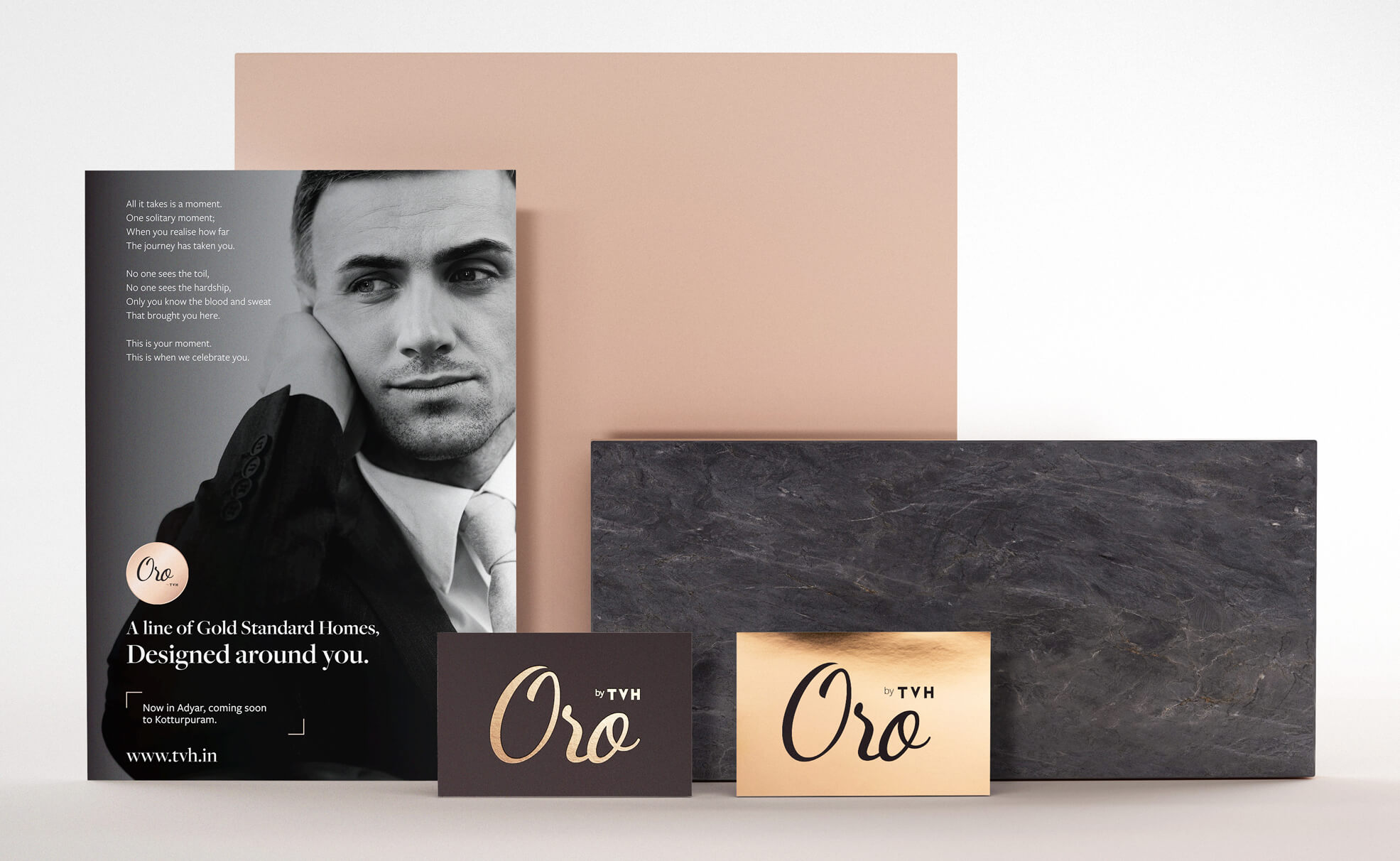
The most successful sales and marketing campaigns are specific, not generic. They also respond to the unique needs and preferences of the market they seek to target. Quadrant & Deltavue by TVH was no exception. As an offering, Quadrant presented beautifully designed homes overlooking the sea and located in the heart of the city. Our challenge was to establish both projects luxury projects from TVH as distintive offerings with a focus on providing outstanding customer experience.


Through close collaboration with the LAZARO Advertising we were able to fine tune the complexity of the brand architecture and create a super luxury brand ORO

01

Logo Design

The biggest problem of the old website was the outdated and Unintuitive architecture of information, Which made it difficult to find the content on the website.
We started our work from the UX stage during which we have prepared a completely new website structure.
Numerous meetings with the client helped us to understand the purpose of the new website and its target group, During the UX stage, We prepared several dozen large mockups that clearly and clearly present the construction of the new website.
On the basis, a completely new copywriting was also created.

02

Branding

The biggest problem of the old website was the outdated and Unintuitive architecture of information, Which made it difficult to find the content on the website.
We started our work from the UX stage during which we have prepared a completely new website structure.
Numerous meetings with the client helped us to understand the purpose of the new website and its target group, During the UX stage, We prepared several dozen large mockups that clearly and clearly present the construction of the new website.
On the basis, a completely new copywriting was also created.


03

Printing

The next stage of our work was the preparation of a new visual layer.

Having a ready structure of the website and full copywriting, we were able to start designing.

An important element of this stage was the preservation of the current visual identity that has existed since the company’s inception.

At the UI stage, a set of iconographies was also created that effectively presents selected content and allows it to be easily found on the website.

The project has kept its minimalist character, but it gained a lot of dynamism and modernity.


04

Website

The next stage of our work was the preparation of a new visual layer.

Having a ready structure of the website and full copywriting, we were able to start designing.

An important element of this stage was the preservation of the current visual identity that has existed since the company’s inception.

At the UI stage, a set of iconographies was also created that effectively presents selected content and allows it to be easily found on the website.

The project has kept its minimalist character, but it gained a lot of dynamism and modernity.

05

Screen Responsive

The next stage of our work was the preparation of a new visual layer.

Having a ready structure of the website and full copywriting, we were able to start designing.

An important element of this stage was the preservation of the current visual identity that has existed since the company’s inception.

At the UI stage, a set of iconographies was also created that effectively presents selected content and allows it to be easily found on the website.

The project has kept its minimalist character, but it gained a lot of dynamism and modernity.

06

Oro Launch Event

The next stage of our work was the preparation of a new visual layer.

Having a ready structure of the website and full copywriting, we were able to start designing.

An important element of this stage was the preservation of the current visual identity that has existed since the company’s inception.

At the UI stage, a set of iconographies was also created that effectively presents selected content and allows it to be easily found on the website.

The project has kept its minimalist character, but it gained a lot of dynamism and modernity.


Have a project in mind